Posts

Showing posts from July, 2024

Final Index

Magazine front cover practical   Advertising and Marketing assessment LR GQ magazine- Language and Representation GQ magazine- Audience and Industries Magazine front cover feedback Gentlewomen- Language and Representation Gentlewomen- Audience and Industries'   End of year 12 paper 1 Mock  Magazine: Appeal of Print  

Industries: the appeal of print - blog tasks

Industries: the appeal of print - blog tasks Work through the following tasks to complete your work on magazines. You will find the reading gives you a brilliant insight into a vital aspect of media - the power of independent institutions. 1) Writer's Edit journal article Read this excellent  Writer's Edit academic journal article on the independent magazine industry  and answer the following questions: 1) What is the definition of an independent print magazine? The independent print magazine  is “published without the financial support of a large corporation or institution in which the makers control publication and distribution." 2) What does Hamilton (2013) suggest about independent magazines in the digital age? "A small but growing body of evidence suggests that small printed magazines  are quietly thriving even as the global newspaper and book industries falter” (Hamilton 2013: 43). 3) Why does the article suggest that independent magazines might be succeeding wh

The Gentlewoman: Audience and Industries blog tasks

  The Gentlewoman: Audience and Industries blog tasks There are five reasonably short tasks for The Gentlewoman - Audience and Industries plus some optional extension work for those aiming for the very top grades. Create a blogpost called 'The Gentlewoman: Audience and Industries' and work through the following: 1) Media Magazine feature: Pleasures of The Gentlewoman Go to  our Media Magazine archive  and read the article on The Gentlewoman (MM84 - page 34). Answer the following questions: 1) What does the article suggest is different about the Gentlewoman compared to traditional women's magazines?  The gentlewoman sticks a middle finger up at these conventions. Its minimalist covers are so completely different that it’s actually shocking. The only text is the title, subtitle and name of the person in the photograph, which is taken as a portrait and framed like a painting. It’s a bold statement that says this is more than just a magazine, this is art. In case it wasn’t diff

Paper 1 Learner Response Mock

Total = (30) = B WWW: A superb Section A ! so impressive and excellent knowledge and quotation focus EBI: The  challenge now is maintain that level across the whole paper. Reflect one what the key factor is : time, revision, different key concepts etc 2) Read  the mark scheme for this exam carefully , paying particular attention to the 'indicative content' for each question. This is some of the best analysis you can do as it gives you an idea of what the exam board is expecting. For your LR blogpost, identify  ONE  point you could have added for the first three questions in Section A: Q1 (unseen text) additional point/theory:  The typography on the advert is all sans serif, offering connotations of a more youthful,  modern brand. The fact the campaign encourages the audience to make this product their  “first Swiss watch” reinforces the feel this is aimed at slightly younger professional men perhaps at the start of a lucrative career. Q2 (unseen text and CSP) additional point/t

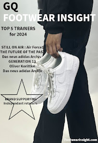
Magazine cover: Learner Response

Image
  Mark out of 15 for Media Language: 8 Estimated A Level coursework grade: C / D 1) Add your finished magazine cover as a JPEG image . 2) Type up your feedback from your teacher. If you've received this by email, you can copy and paste it across - WWW and EBIs. You don't need to include a mark or grade if you don't want to. WWW: You have created and submitted a magazine cover but no evaluation or planning – and these elements are an important part of the project. Your cover is definitely recognisable as a copy of Footwear Insight but it copies some of the aspects of the original cover you have posted (e.g. the star) rather than offering your own take on these design elements. However, the image is strong – excellent lack of shadow on the backdrop. EBI: There are a few areas we can improve on. Firstly, the text layout is not as professional as it could be. You have text going over the image (which makes it difficult to read and also reduces the quality of the image) and the